Case Study
A Payment Ecosystem for Modern Businesses
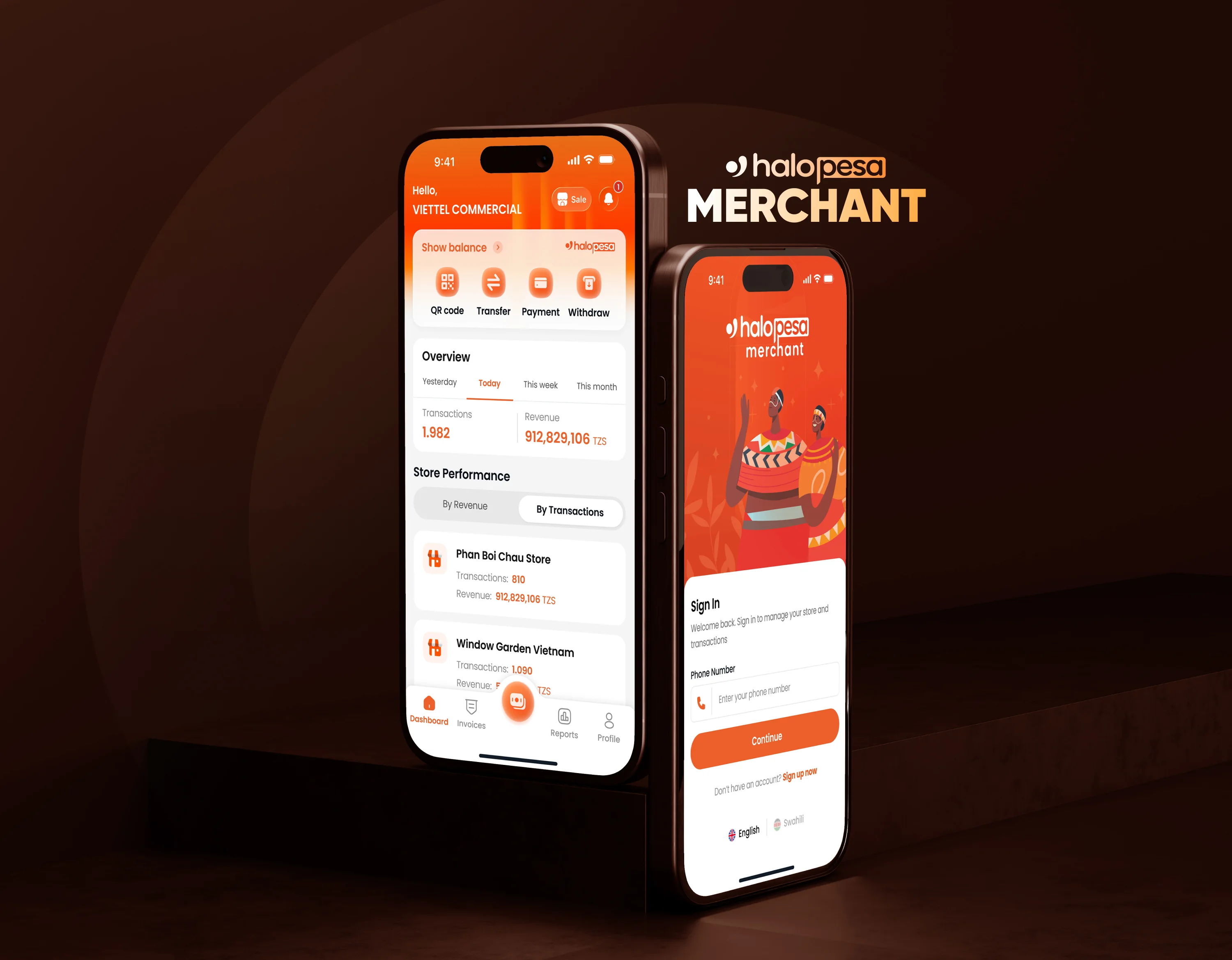
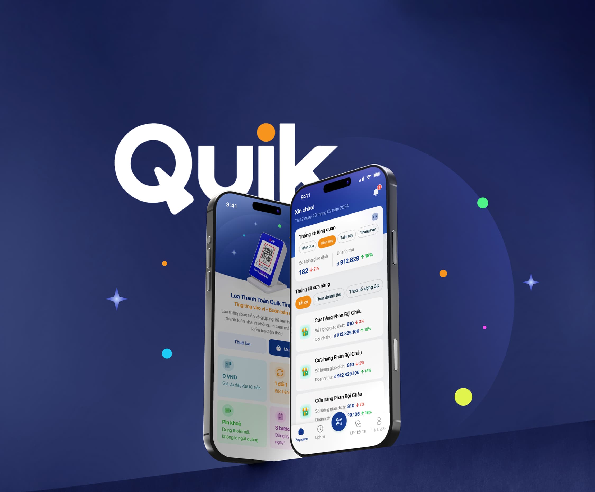
QUIK provides a comprehensive digital payment ecosystem that helps businesses across industries manage transactions, integrate payment services, and deliver seamless customer experiences. Built with secure and scalable technology, the platform connects businesses with modern payment solutions designed to support efficient operations, business growth, and evolving digital needs.
Role
Senior UX/UI Designer
Company
Vinatti
Platforms
iOS · Android · Web · WebView
Partners
VPBank · BIDV · MB · Napas / VietQR

Quik Agent Banking
A bank-agent network that lets everyday merchants act as VPBank's cash counter — without a bank branch in sight.
The Challenge
VPBank wanted to extend basic banking — deposits and withdrawals — into areas without a nearby branch, using local shops as agents instead of building physical infrastructure. The hard part wasn't the banking logic; it was making a compliance-heavy, cash-handling flow feel safe and fast for a teller who isn't a bank employee, while giving VPBank's own admins a way to see and manage the whole agent network.
Users & Context
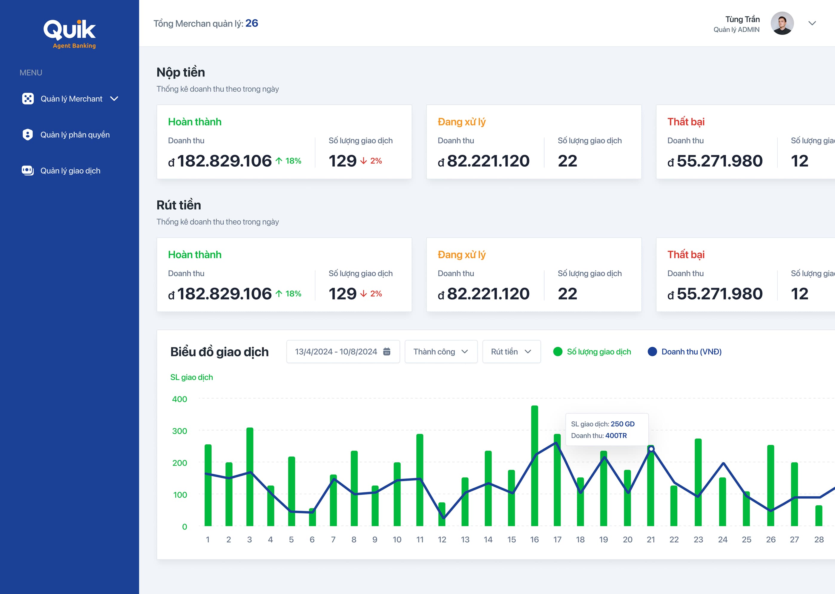
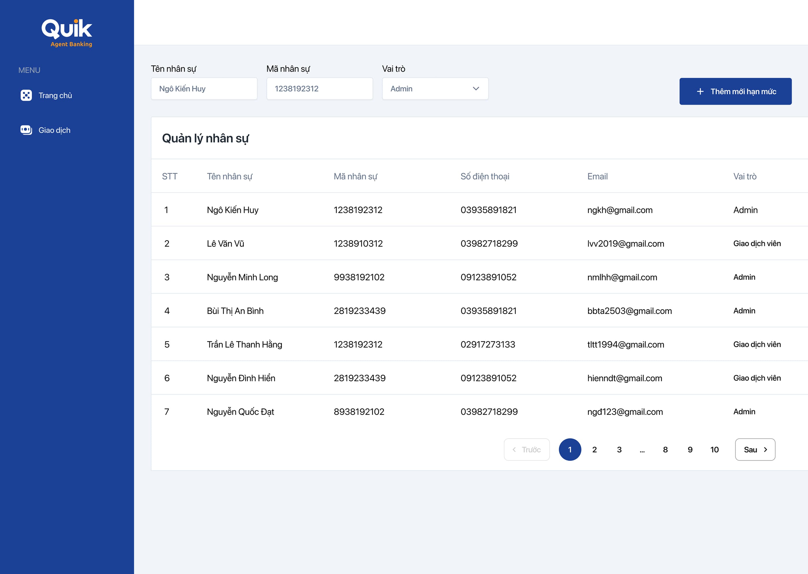
The product serves two distinct user groups: bank tellers handling deposits and withdrawals on mobile devices while assisting customers in real time, and admins overseeing operations across multiple merchant locations from a centralized web dashboard.

Approach
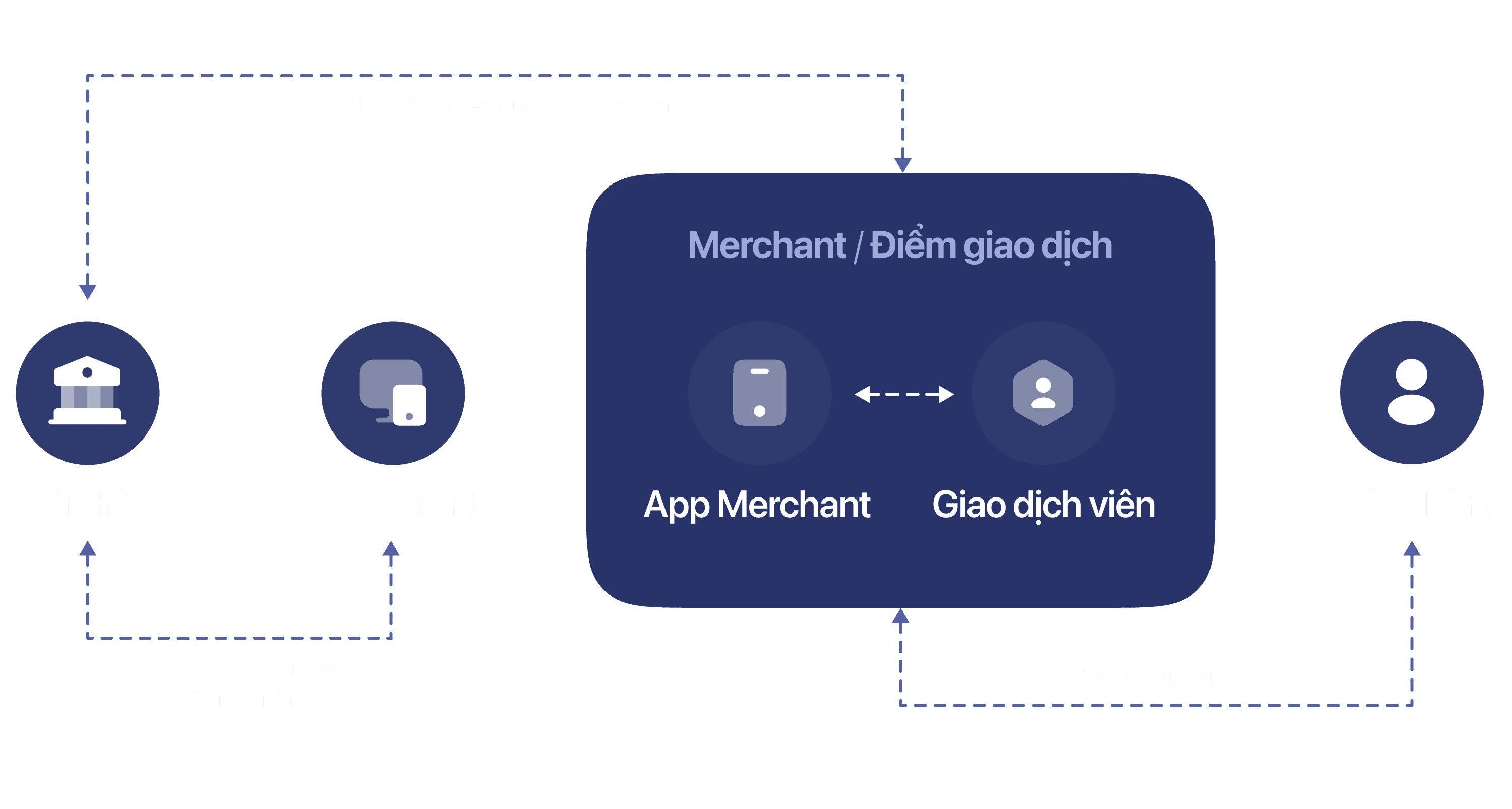
Mapped the four-party flow before drawing a single screen — Bank ↔ Web Agent ↔ Merchant (App + Teller) ↔ Customer — so every UI decision traced back to who needed to see what, and when.
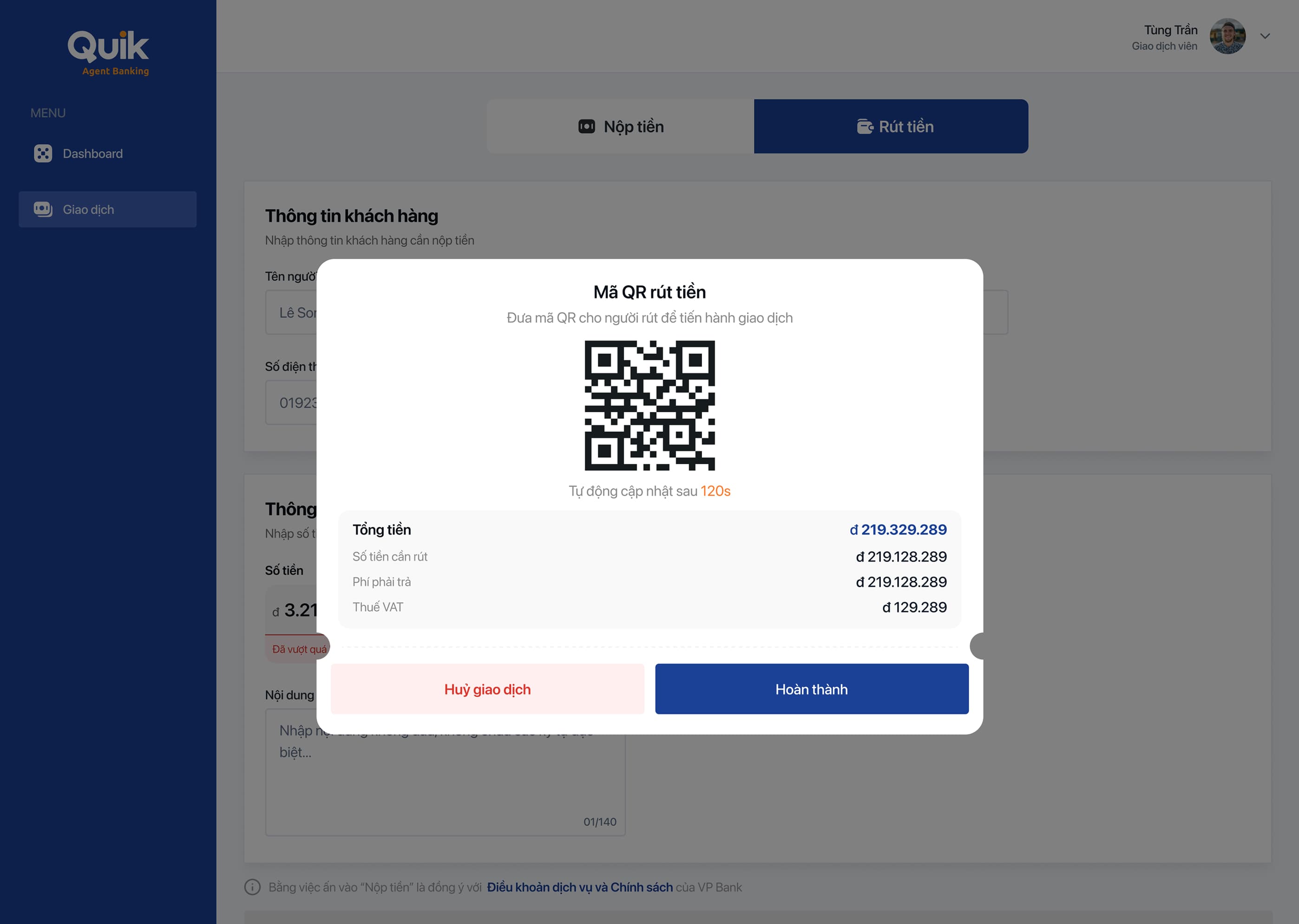
Iterated the withdrawal flow around trust, not just speed: early drafts had a teller hand over cash on a typed confirmation; we replaced it with a one-time QR code the customer scans themselves, closing the biggest dispute risk without adding a step to the happy path.
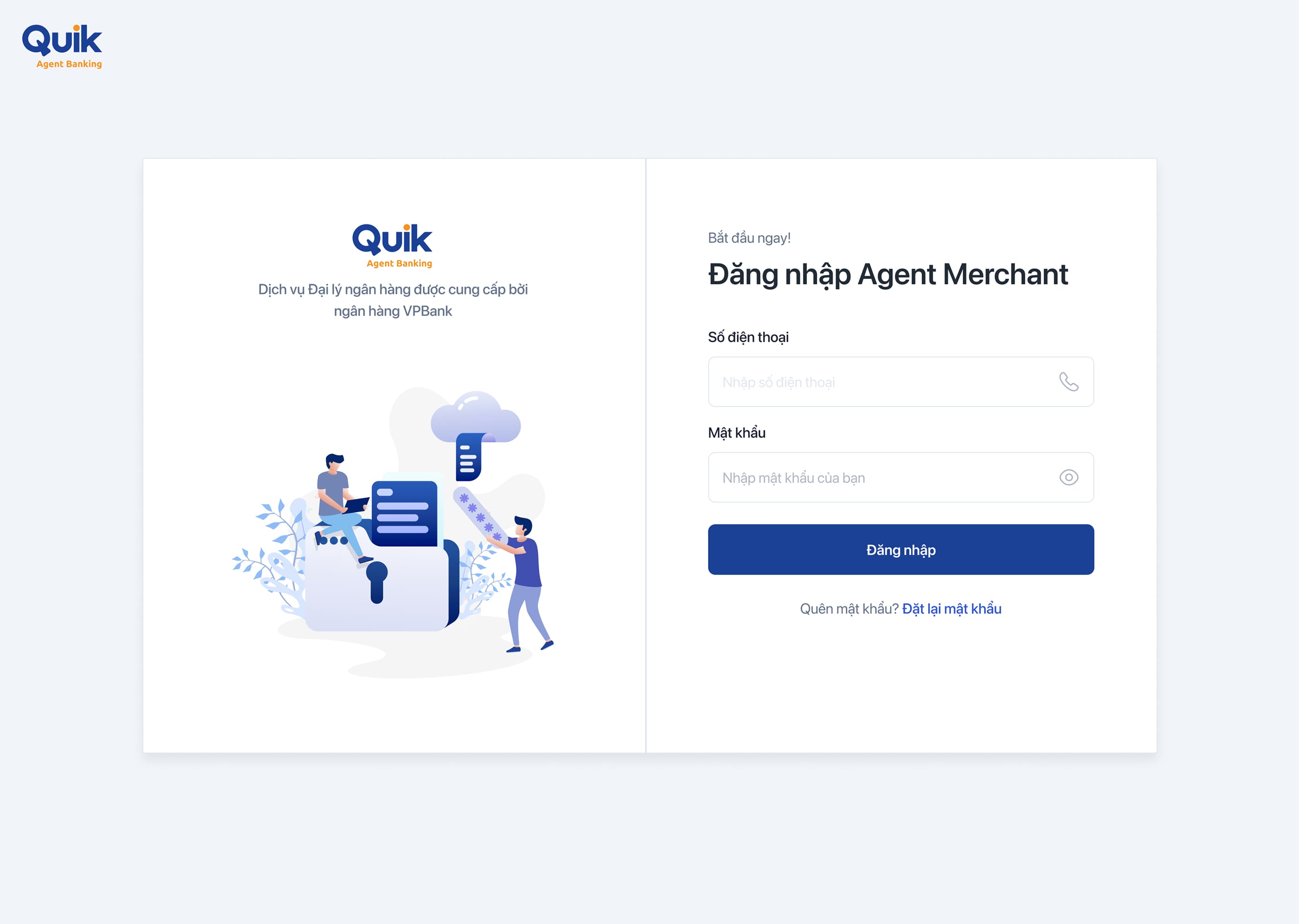
Built app and web as one system, not two separate builds: deposit/withdraw tabs, transaction states and staff records share the same information architecture, so switching between a teller's phone and a manager's dashboard never feels like switching products.
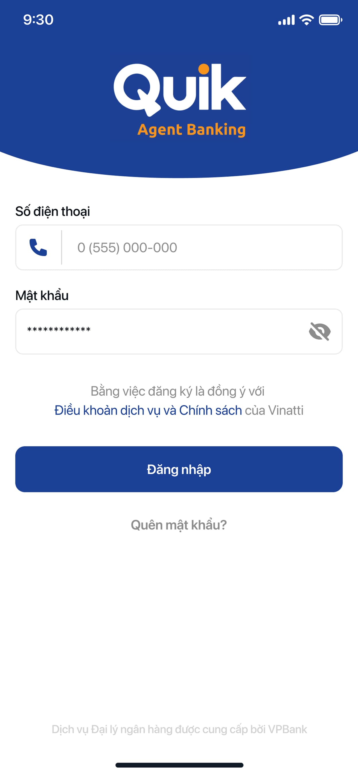
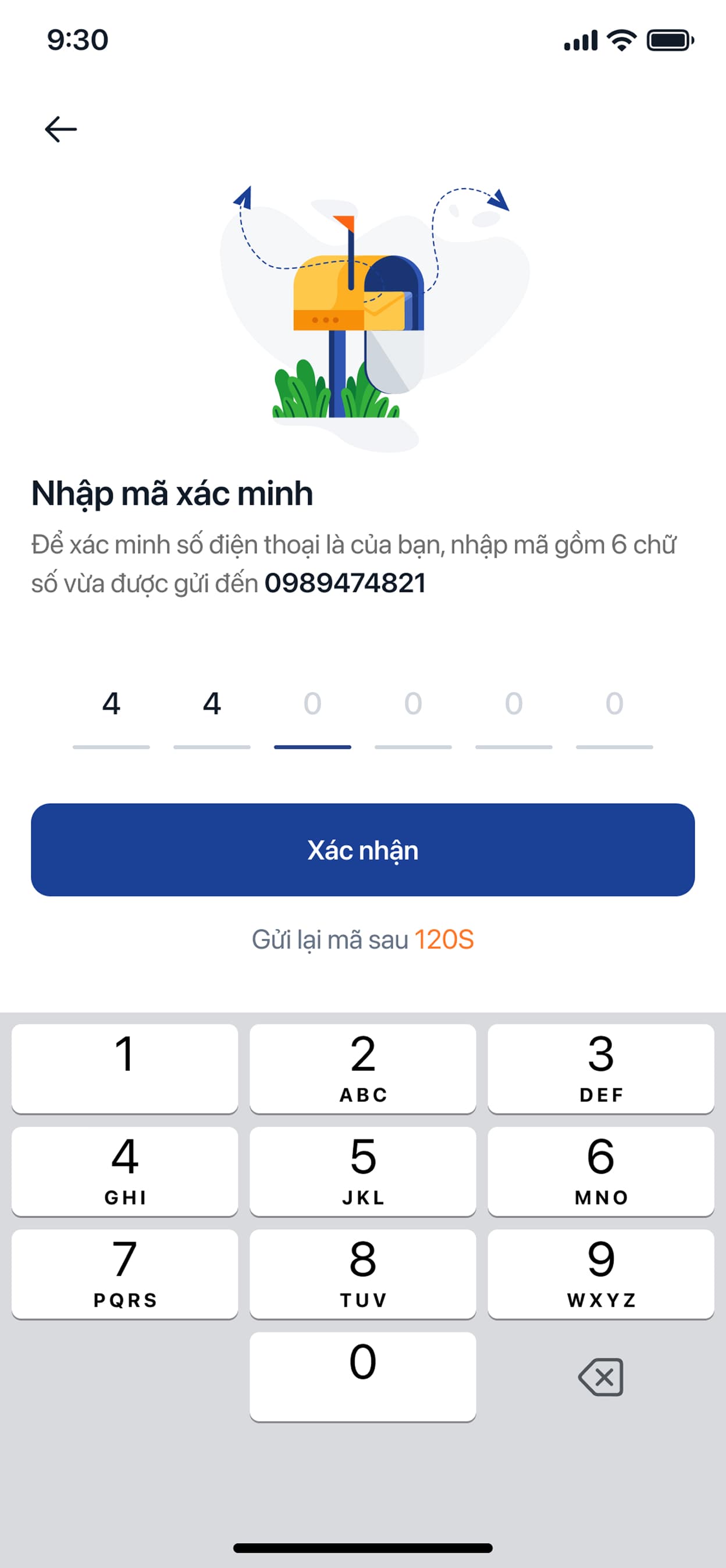
Here's the product in your hands — the mobile app version.
Login
Transactions
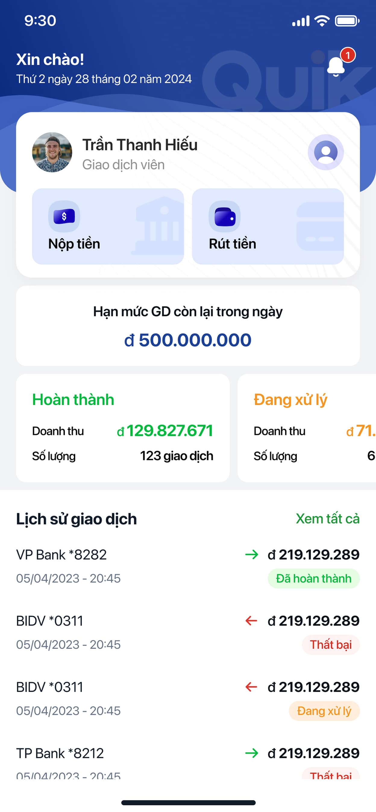
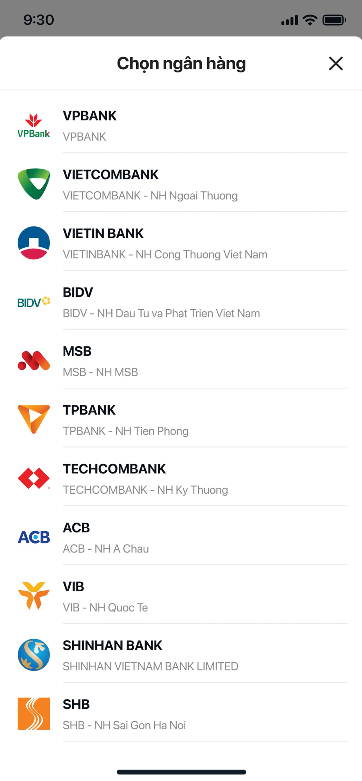
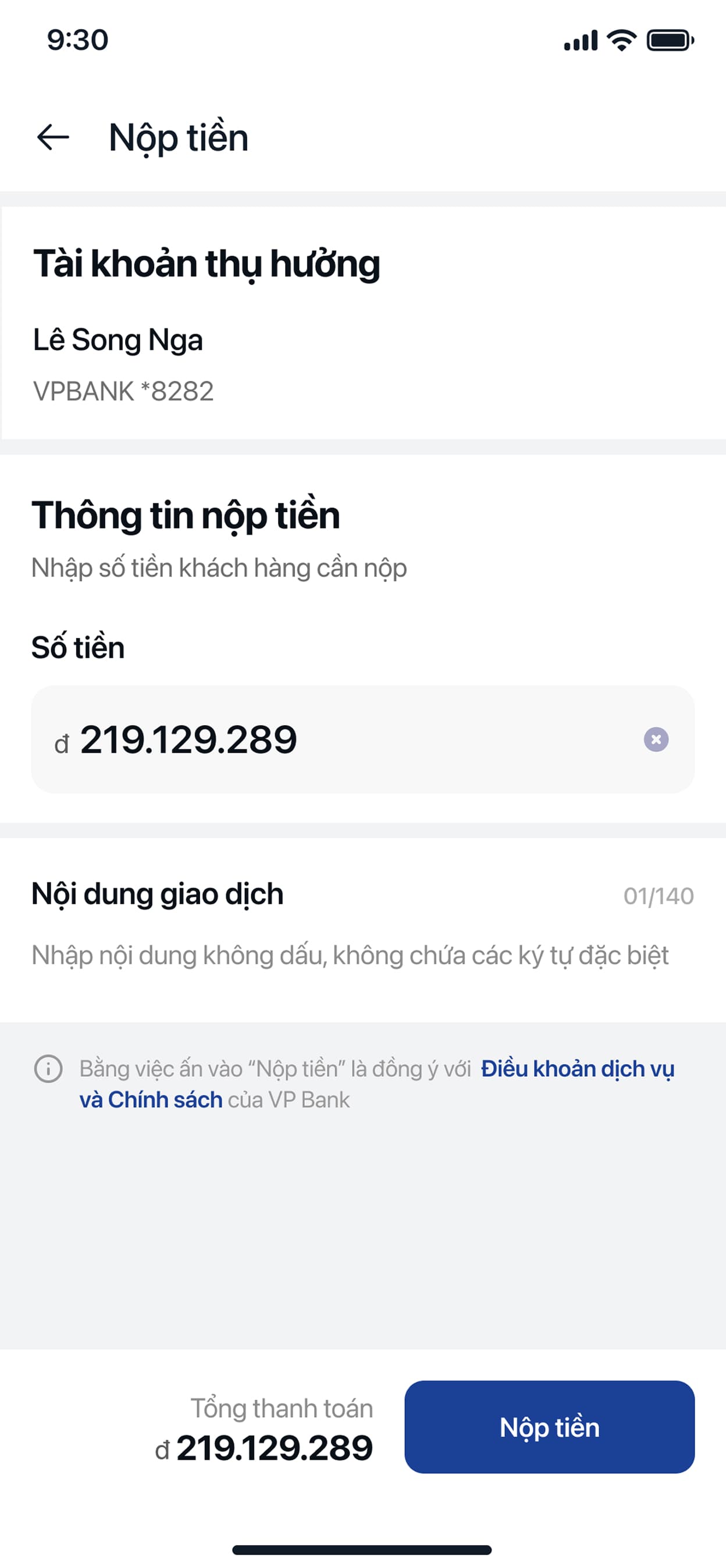
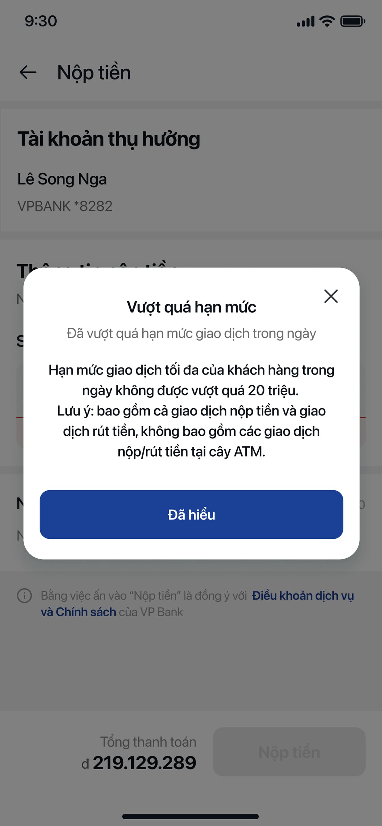
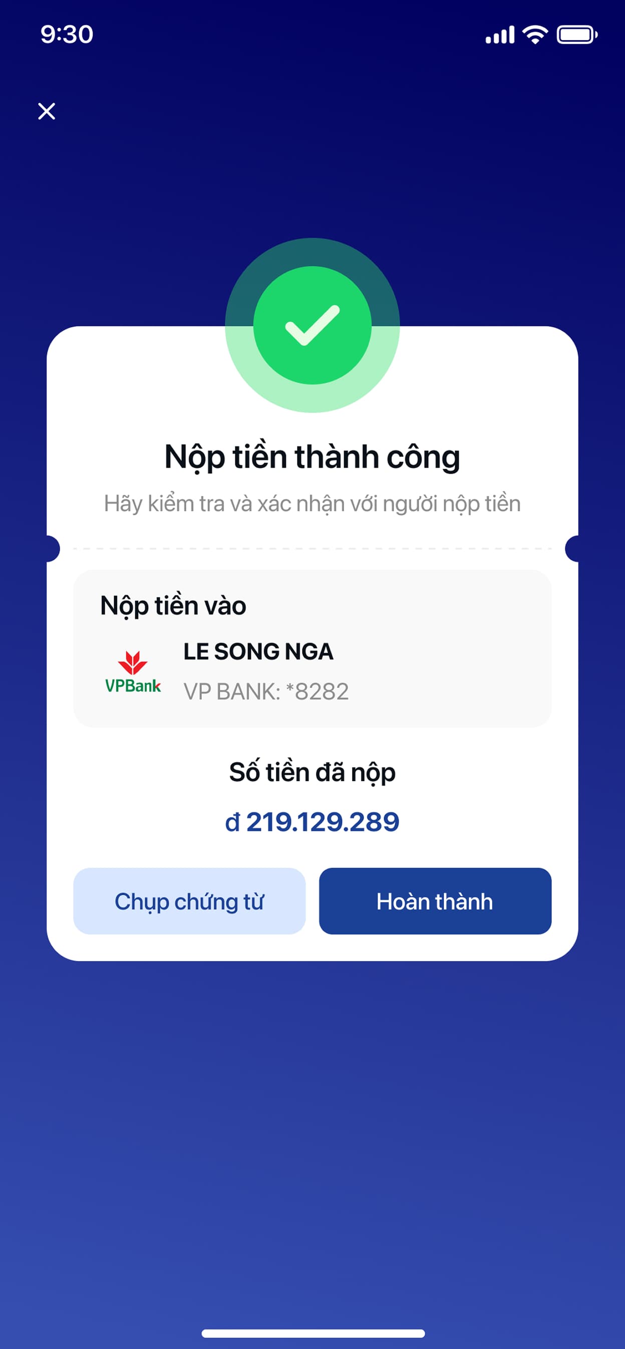
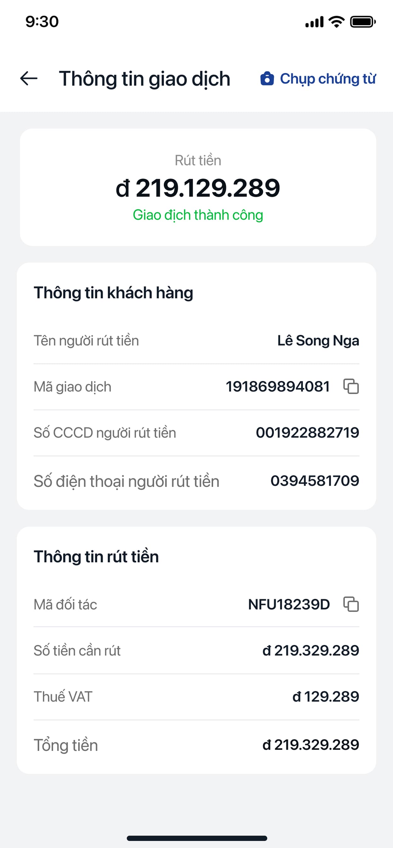
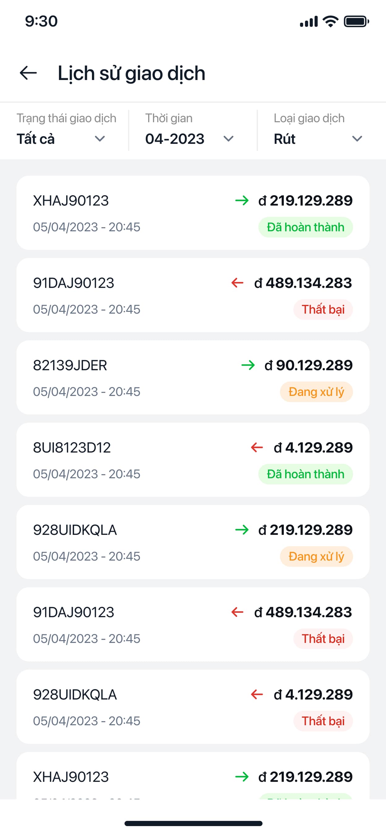
And the same experience on the big screen — the web version.
Web Dashboard







Quik Ting Ting
A payment-notification speaker for small retailers — plus the store it's sold through.
The Challenge
Street vendors and small shop owners in Vietnam mostly accept QR payments now, but confirming one still means unlocking a phone, opening a banking app, and squinting at a screen while a customer waits and the next one queues up. Quik Ting Ting is a small hardware speaker that announces a payment out loud the moment a VietQR/Napas transfer lands, so a vendor never has to look at their phone to know they got paid.
Approach
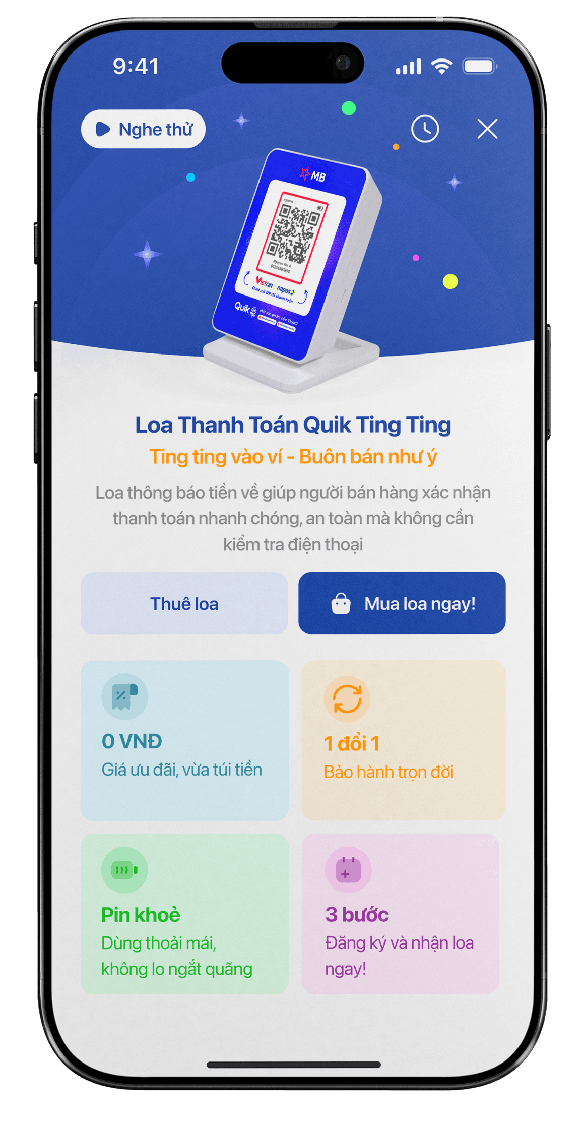
Sold the device like a subscription, not a gadget: the storefront leads with a free speaker, but the real commitment is a 6- or 12-month service plan, with a lifetime one-for-one warranty spelled out on the same screen as the price.
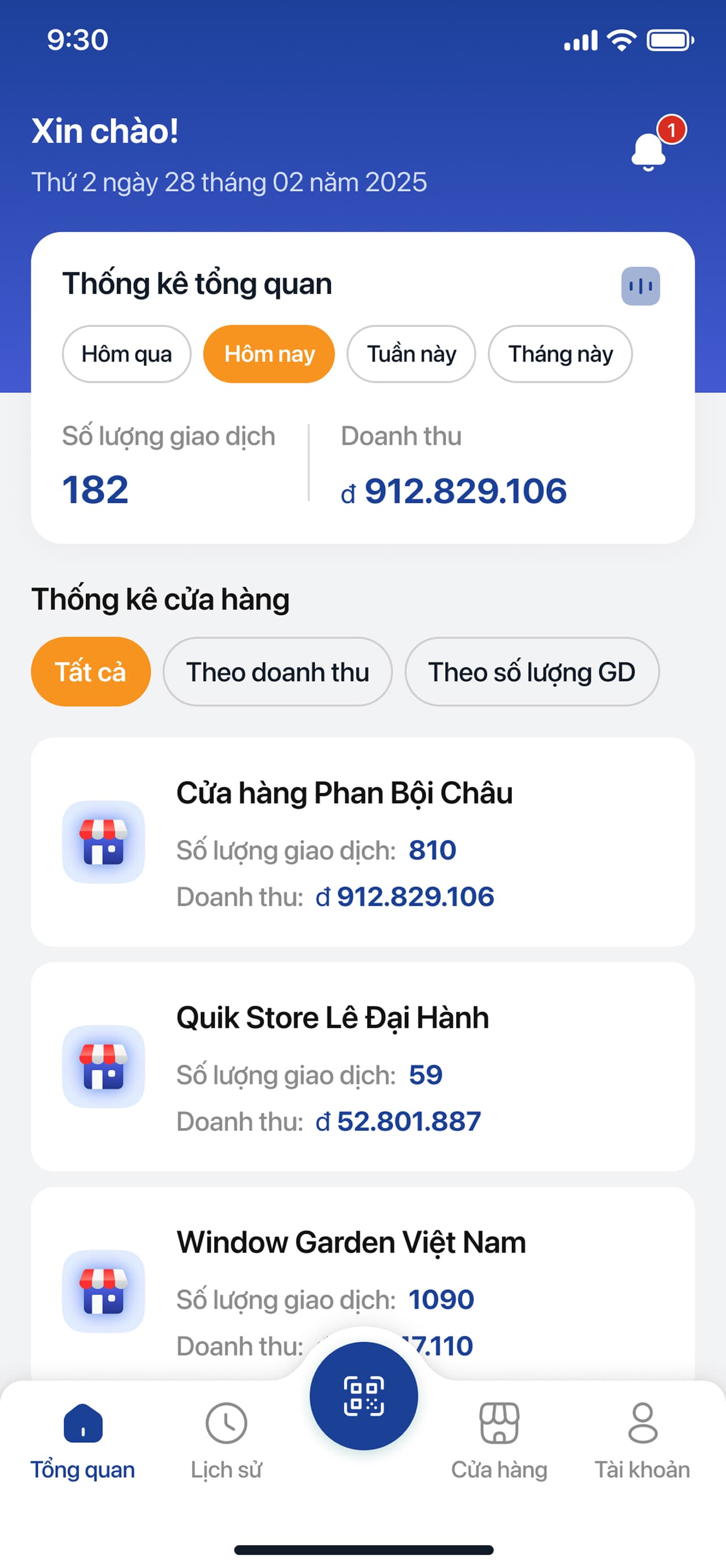
Made the merchant app do double duty — the same app that manages the speaker's linked bank account also has a plain cash-payment calculator, because not every sale goes through QR, and a payments app that only handles QR isn't actually useful for a full shift.
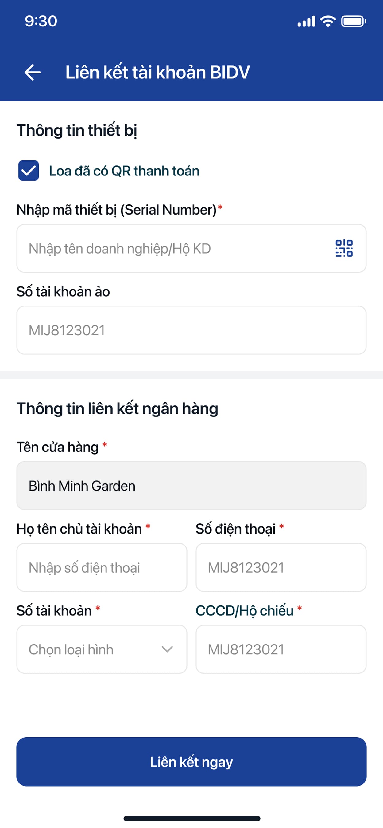
Kept the pairing flow physical-first: linking a speaker to a bank account starts by scanning the serial QR printed on the device, not typing a code, because it's set up once by hand, often by someone who isn't especially tech-comfortable.
Gave the storefront the same rigor as the app — package comparisons, delivery-vs-pickup, and order confirmation, because quiktingting.vn is a real, live store, not a placeholder page.
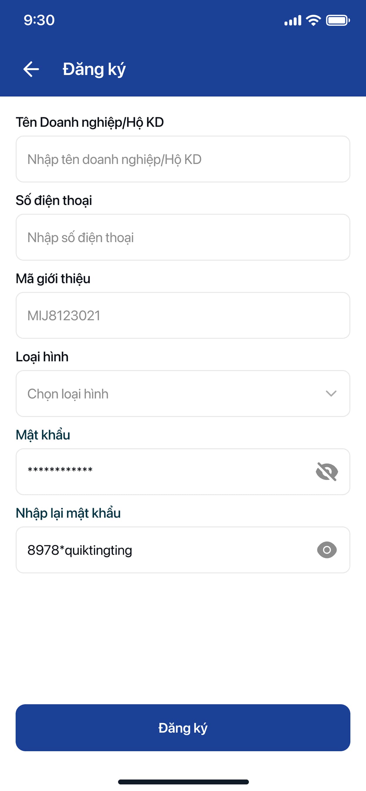
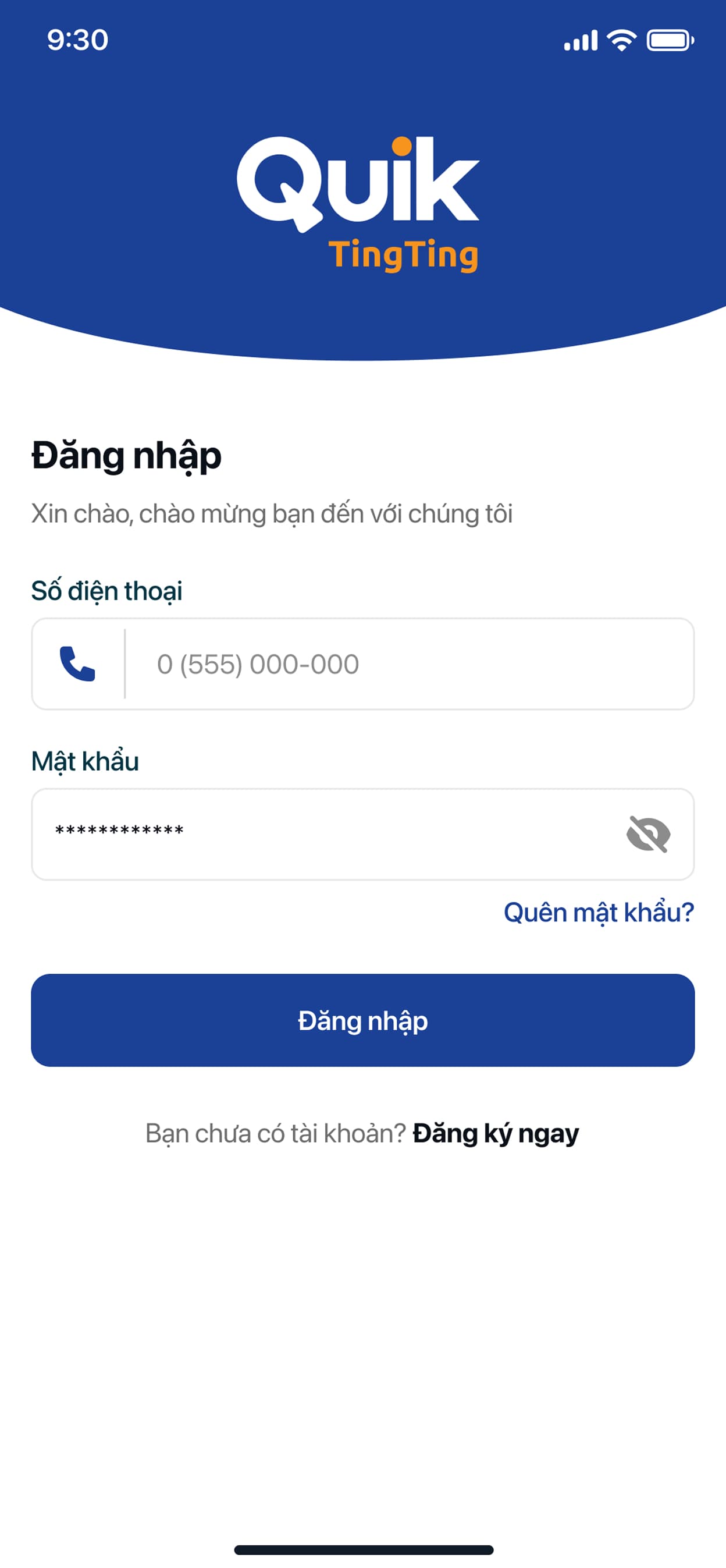
Merchant Operations App
Login
Management
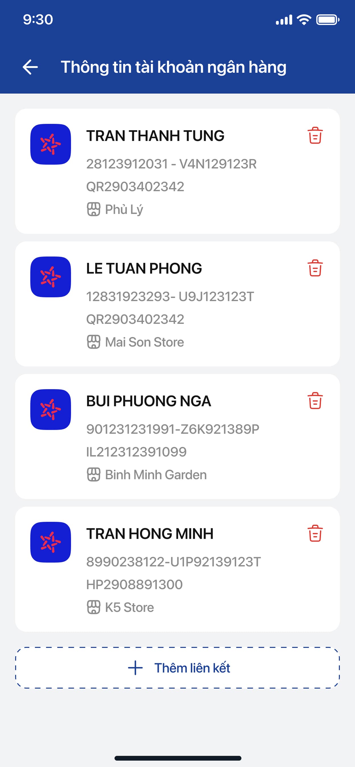
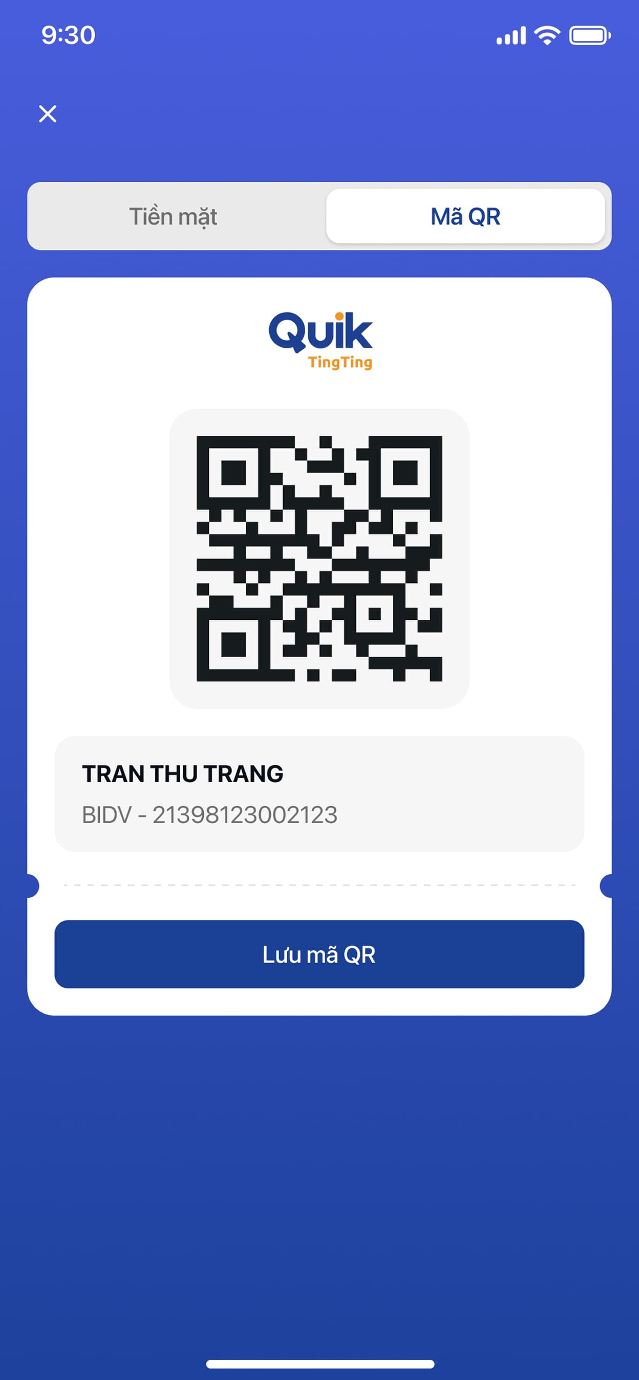
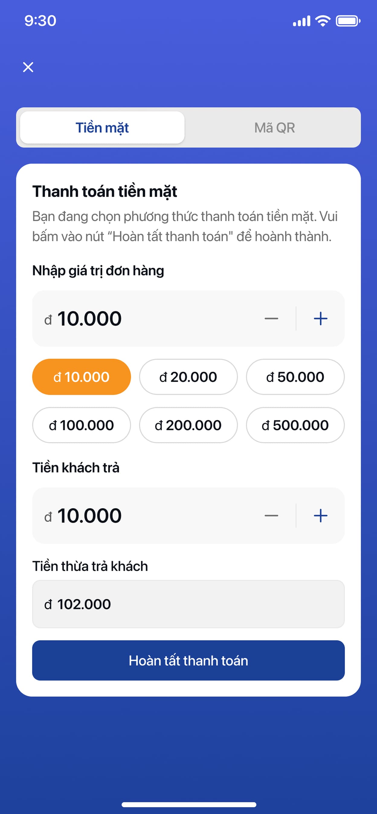
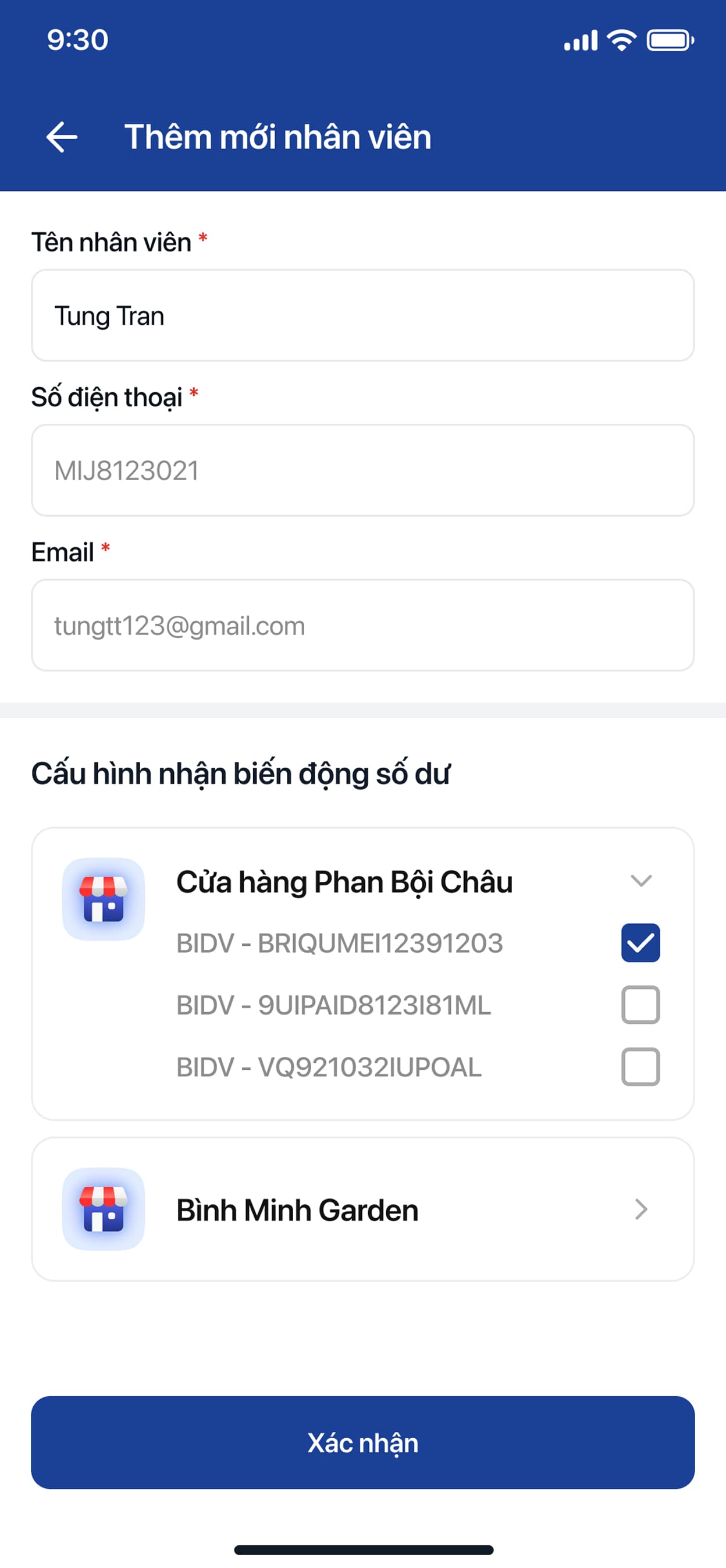
Webview for buying speakers
Buy A Speaker
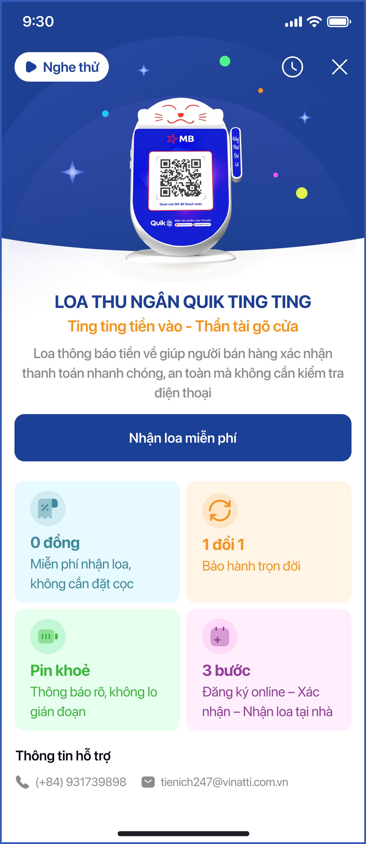
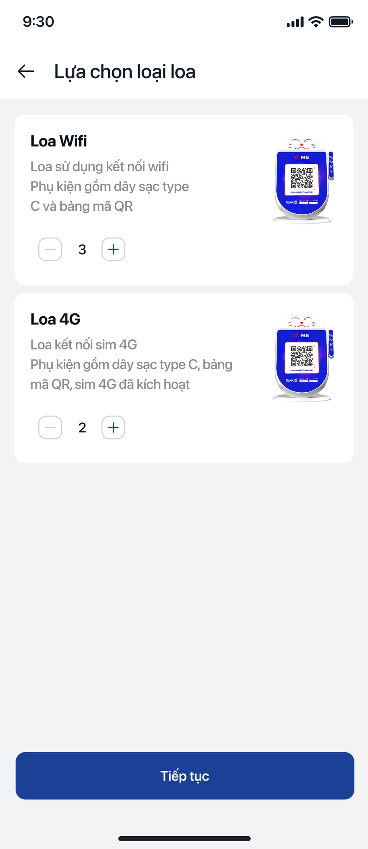
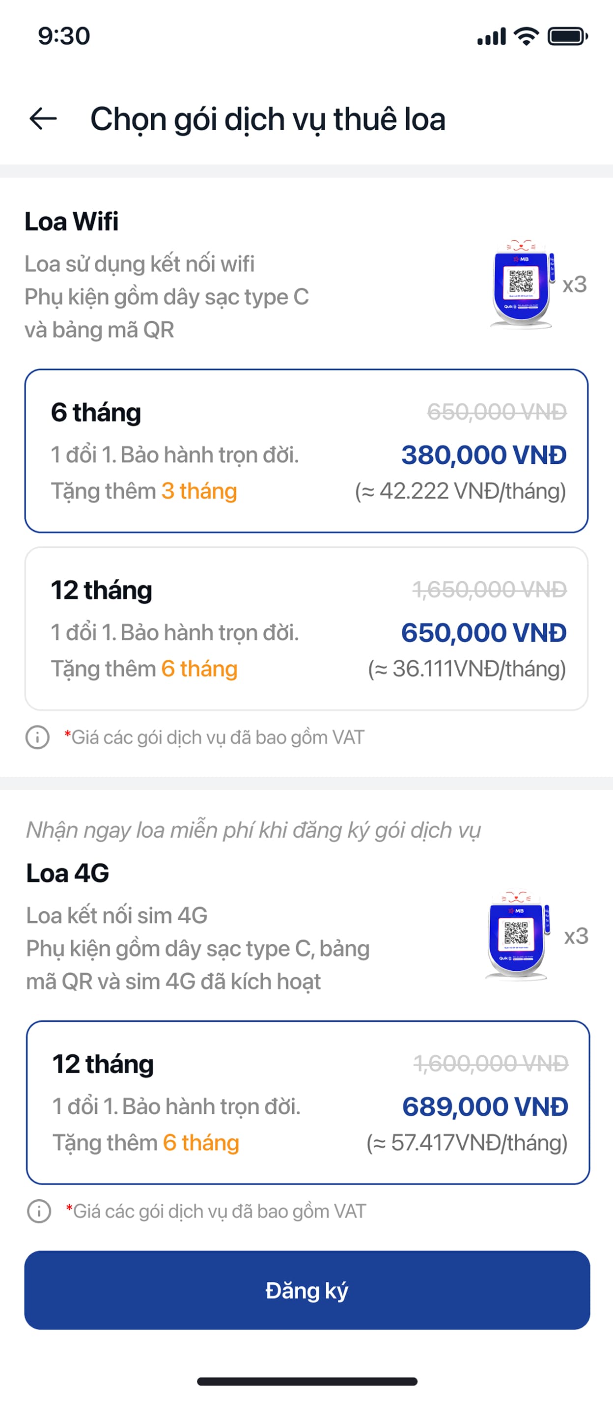
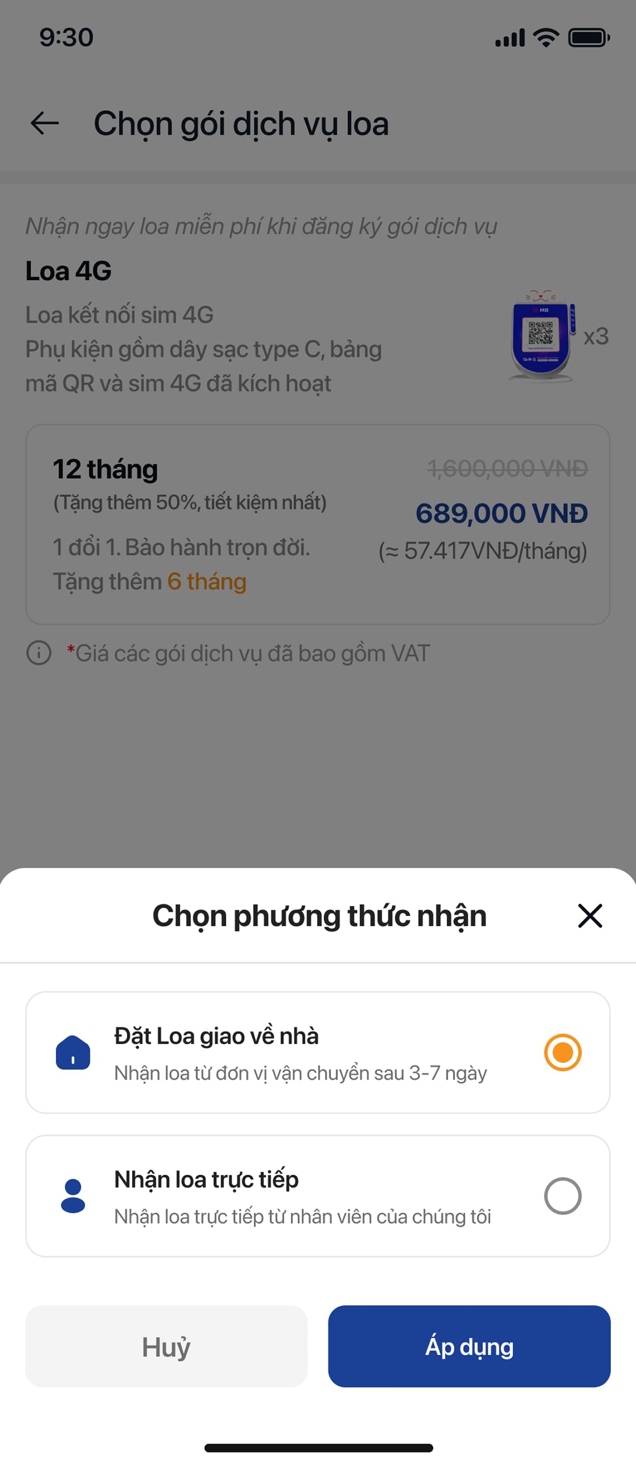
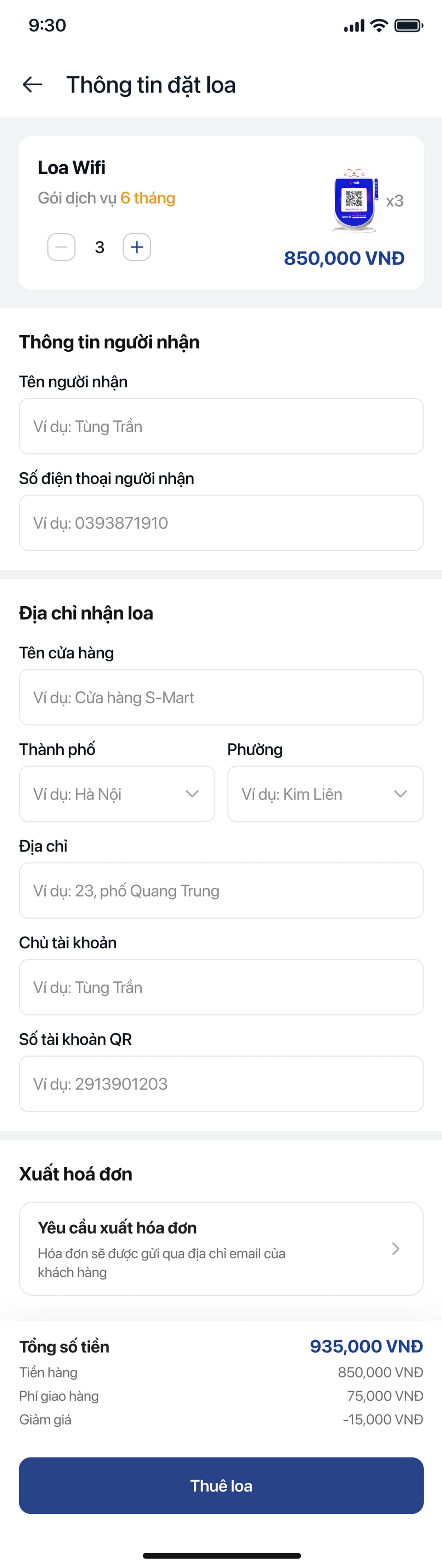

Ting Ting also had to work as a piece of e-commerce, not just a product screen — the storefront is the first thing a prospective merchant ever sees of the brand, so it had to carry the same trust signals as the app that comes after it.

Quik SIM
A destination-first marketplace for travel SIMs and eSIMs, bought before you ever land.
The Challenge
Vietnamese travelers buying a local SIM abroad usually do it the hard way: at the airport, in a language they don't speak, from whichever kiosk has the shortest queue. Quik SIM turns that into a browse-before-you-fly experience — physical SIM or eSIM, organized by destination, with pricing and policy visible before departure.
Users & Context
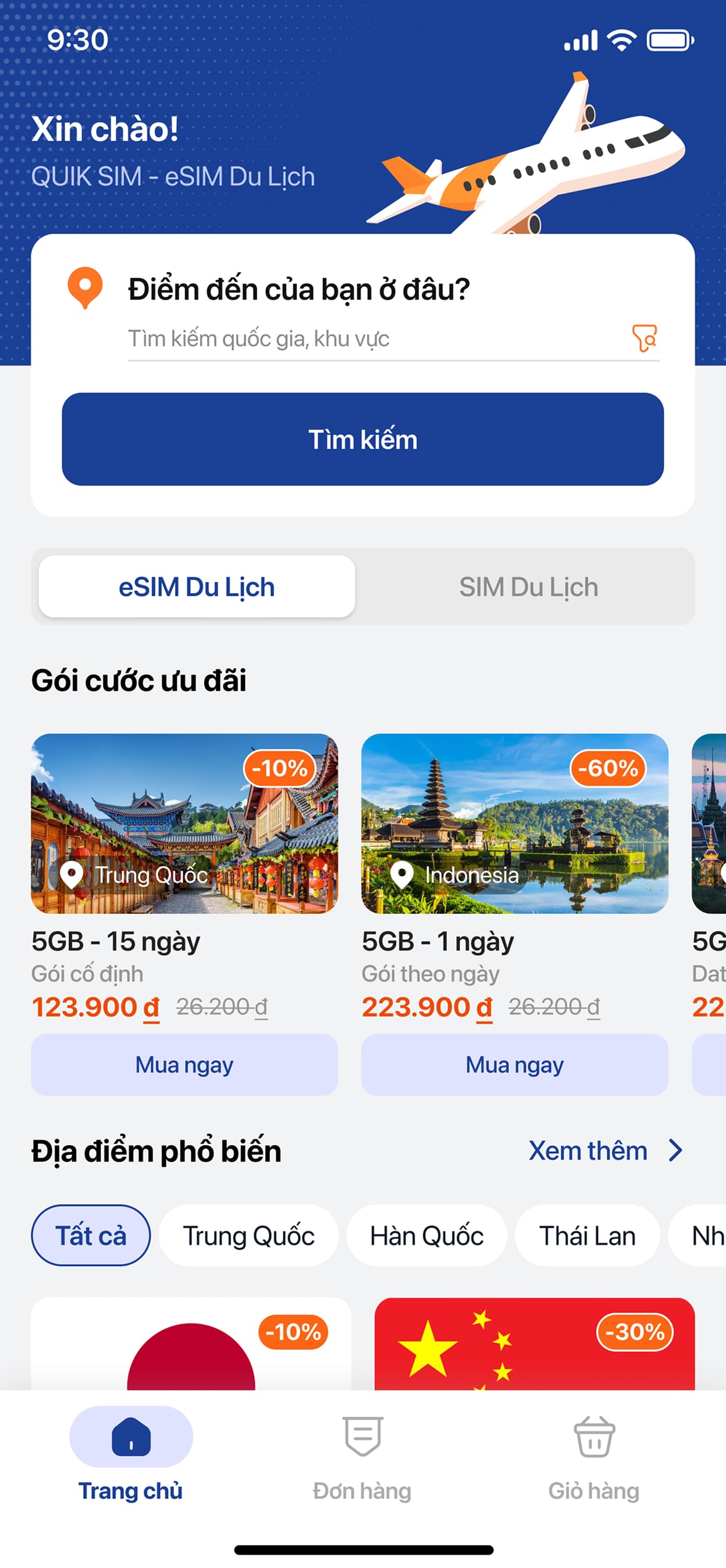
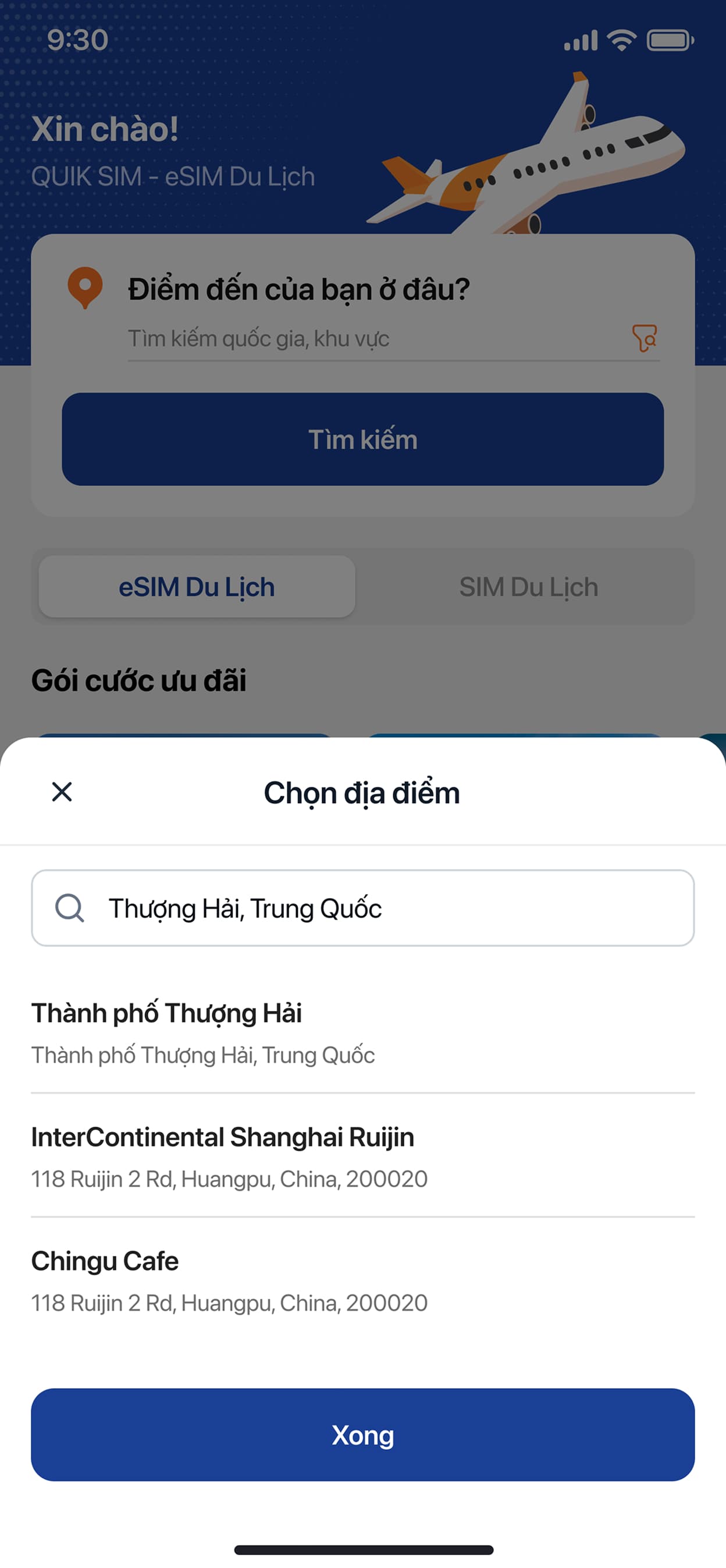
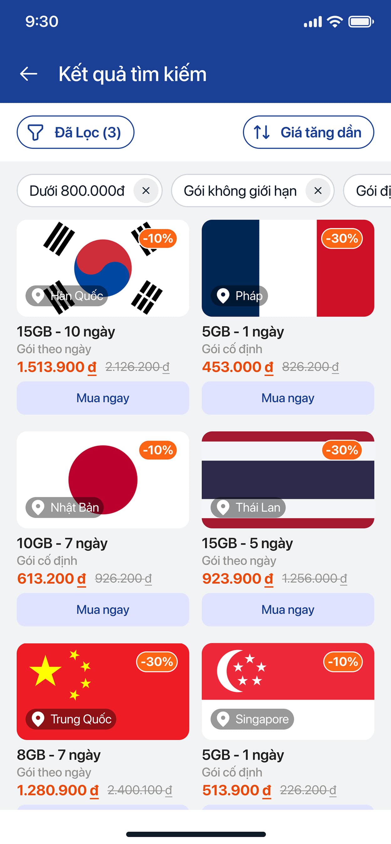
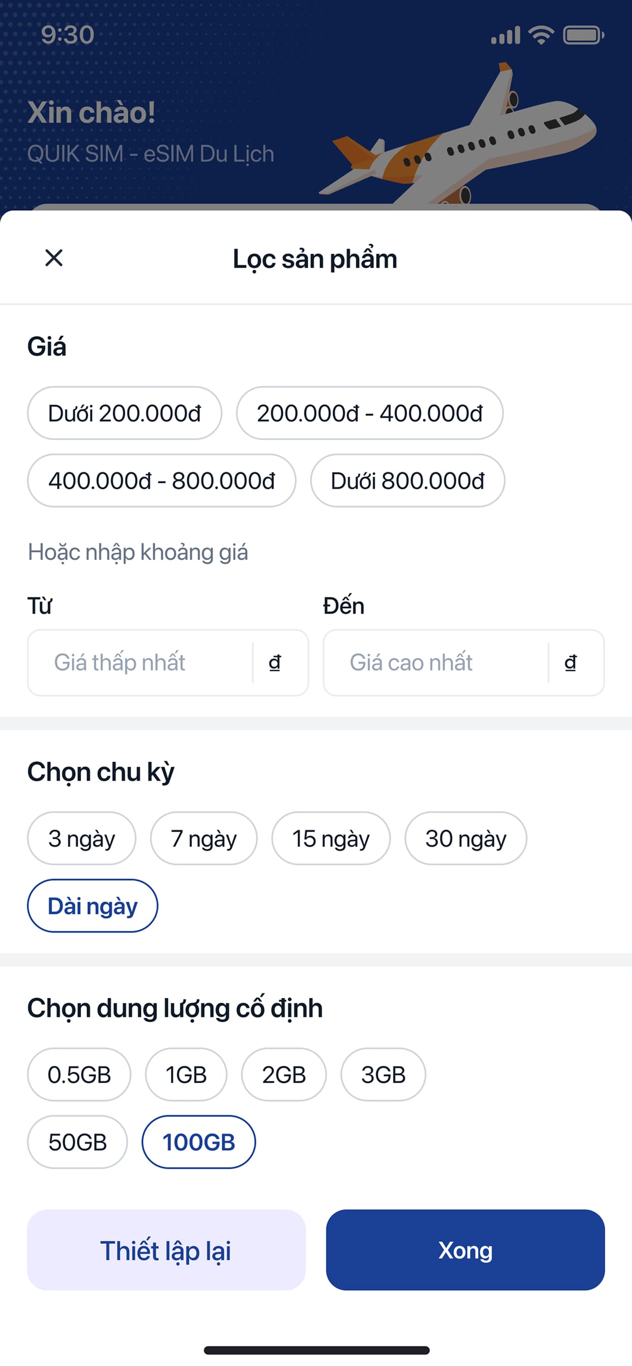
Two shopping habits had to coexist in one app: a traveler who already knows their destination and just wants the fastest checkout, and someone still comparing countries, data caps and validity windows before committing. The home screen's search-first layout serves the first group; filters and sortable results serve the second.
Approach
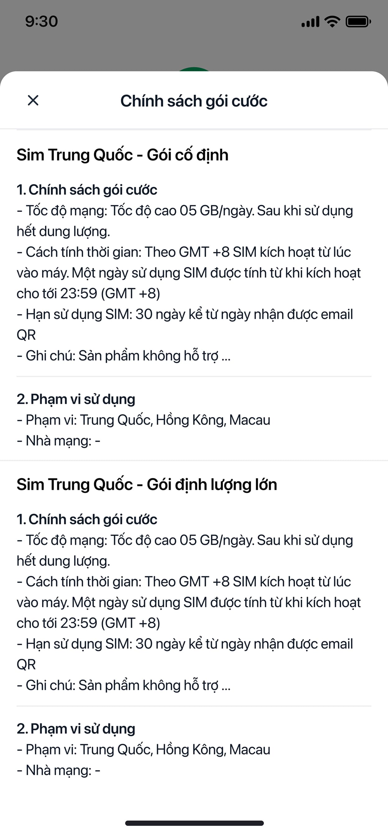
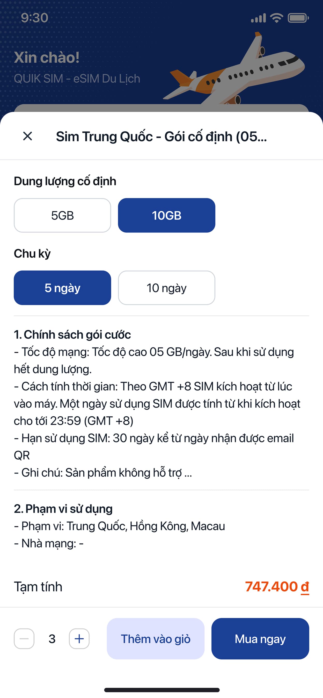
Treated policy as a feature, not fine print: an eSIM is invisible until it's installed, so the plan-detail screen states network speed after the data cap, how a "day" is metered (GMT+8, midnight cutoff) and the 30-day activation window before the user has committed to anything.
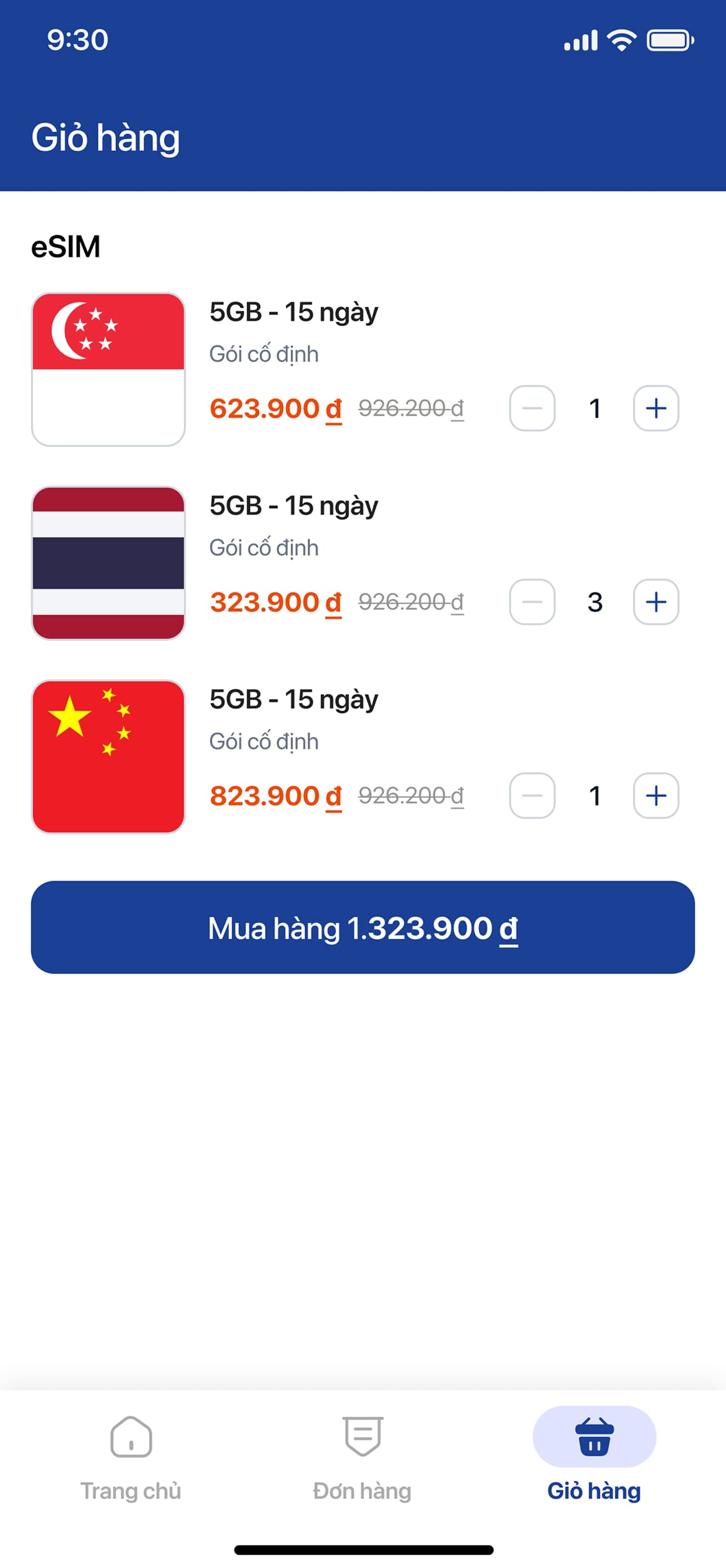
Designed the cart for itineraries, not single purchases — letting a Singapore, Thailand and China SIM sit in one checkout was a deliberate call for multi-stop trips, not a default we fell into.
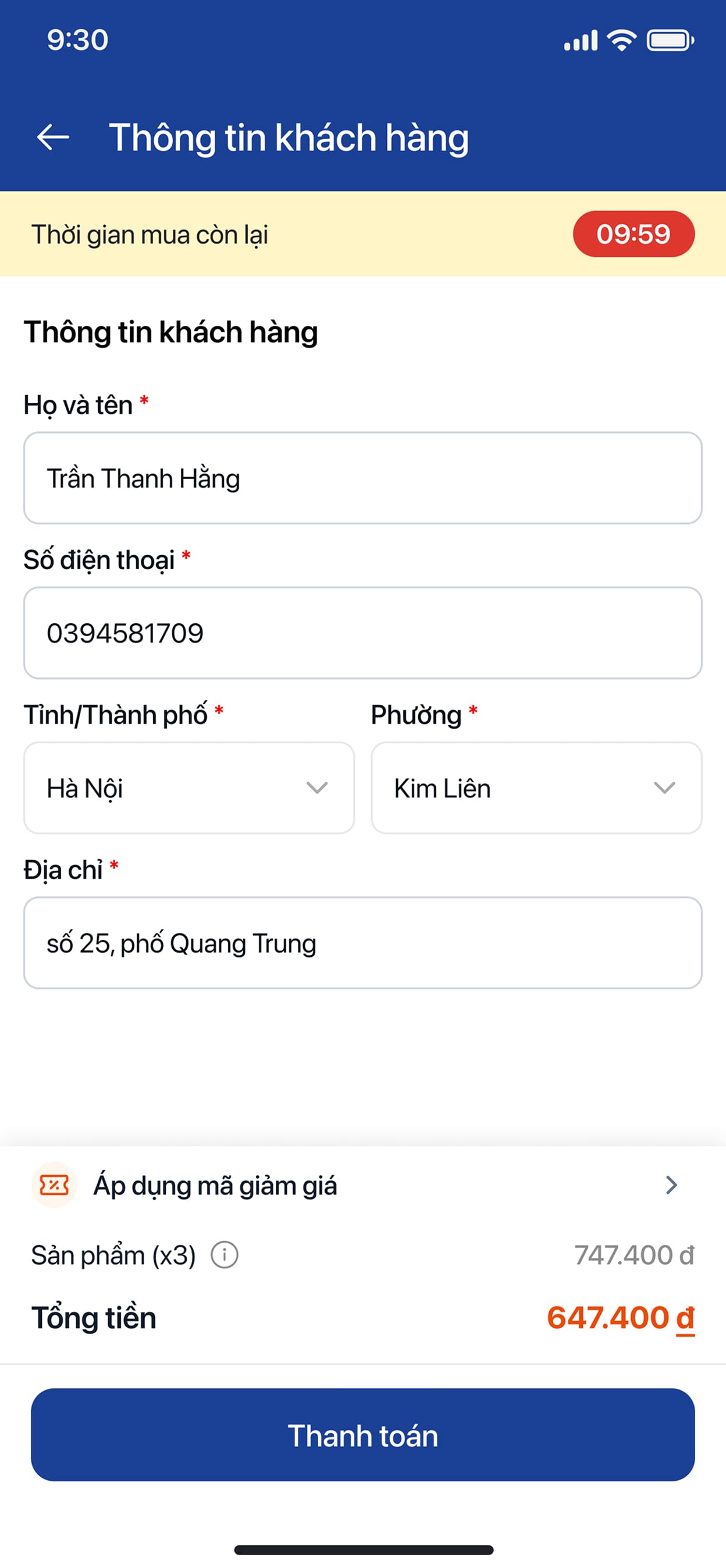
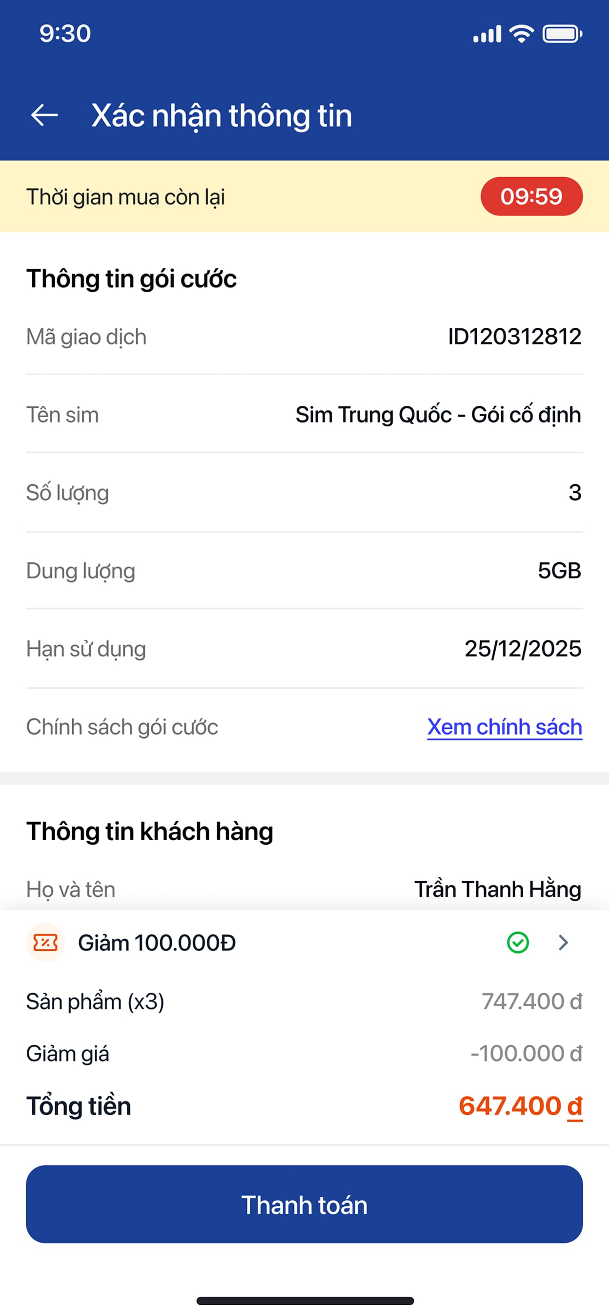
Used a visible countdown as a fairness mechanic at checkout: it isn't there to pressure a purchase, it protects a reserved price from being held indefinitely while someone browses away.
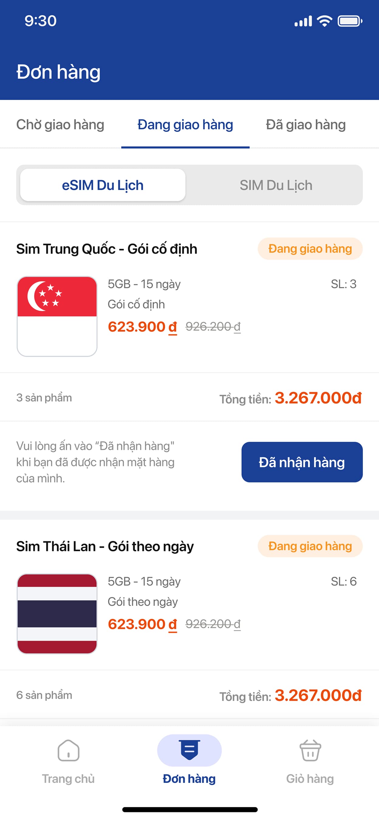
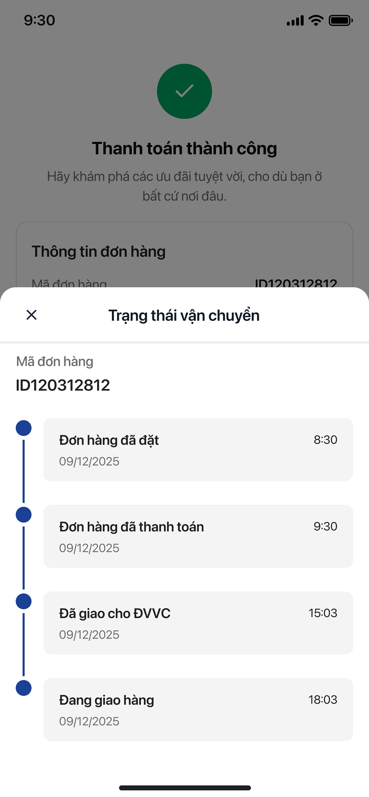
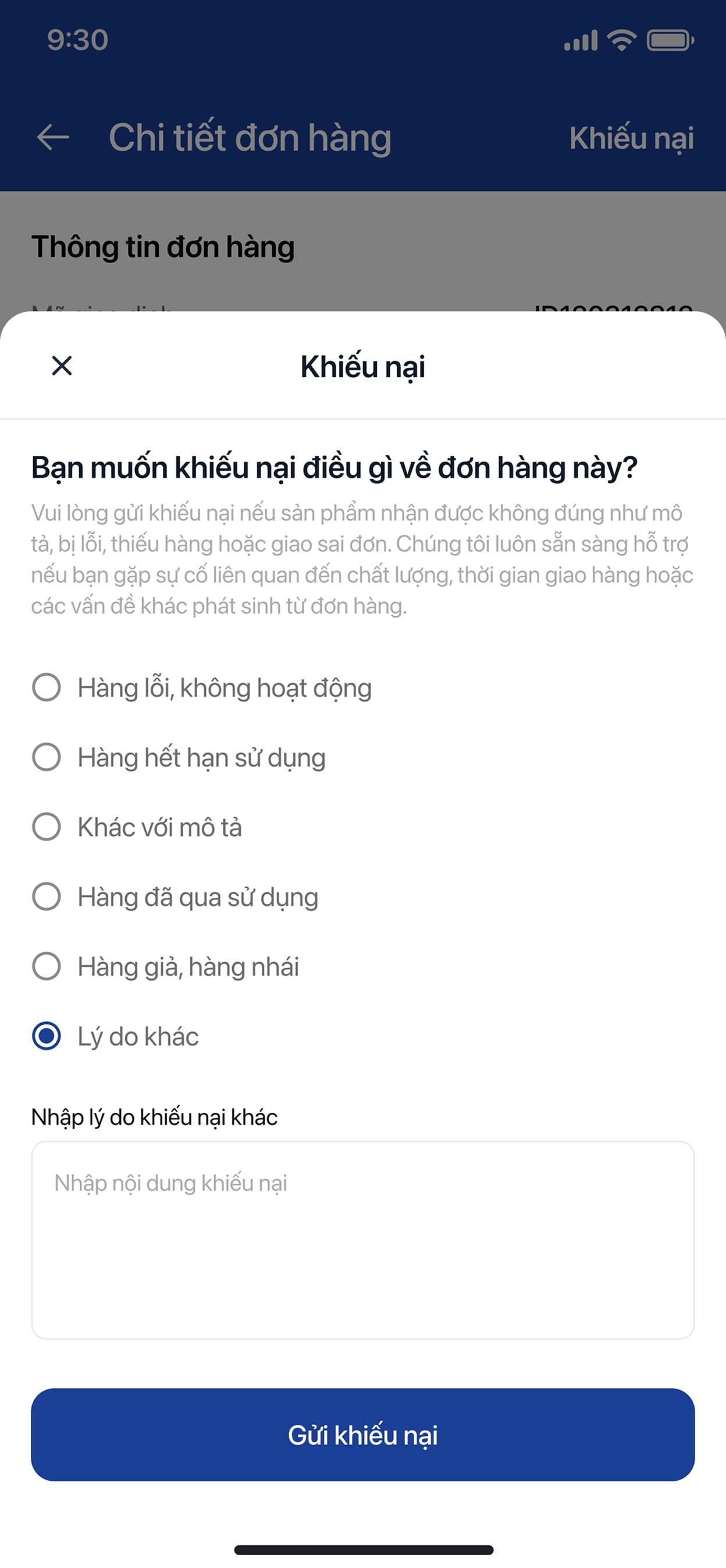
Gave physical SIM orders the same rigor as any e-commerce delivery — status tabs, a timestamped tracking timeline and a structured complaint flow, because a SIM that doesn't arrive before a flight is a bigger problem than a normal late parcel.
Here's the product in your hands — the mobile app version.
Browse & Search
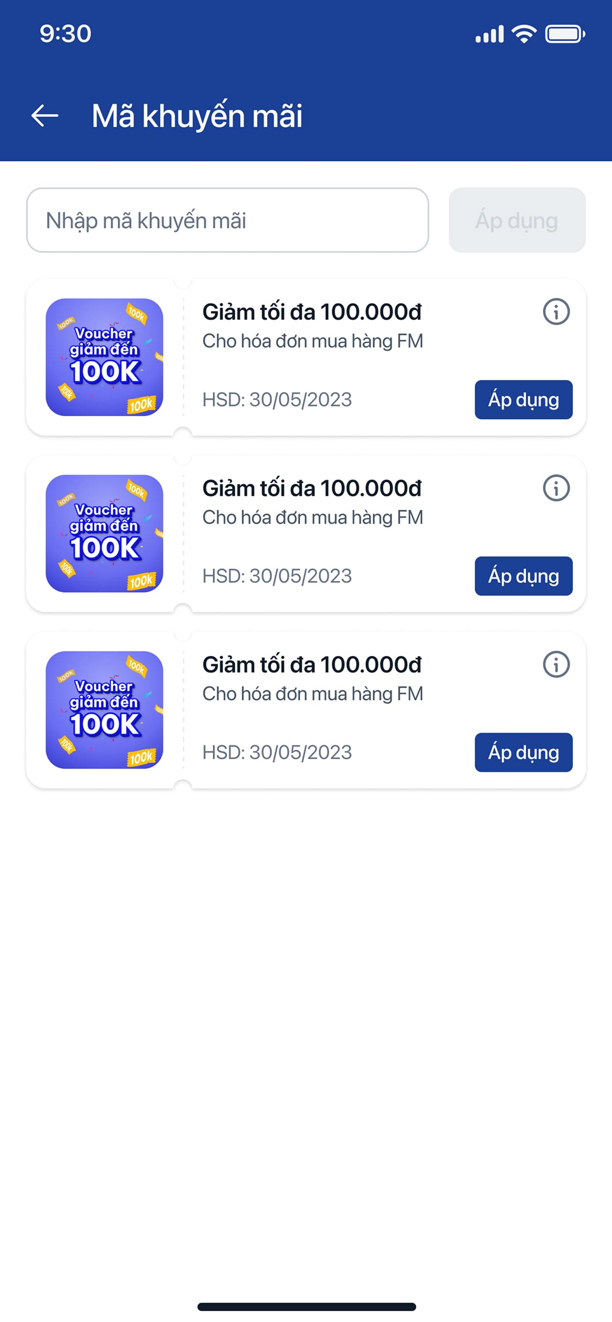
Checkout
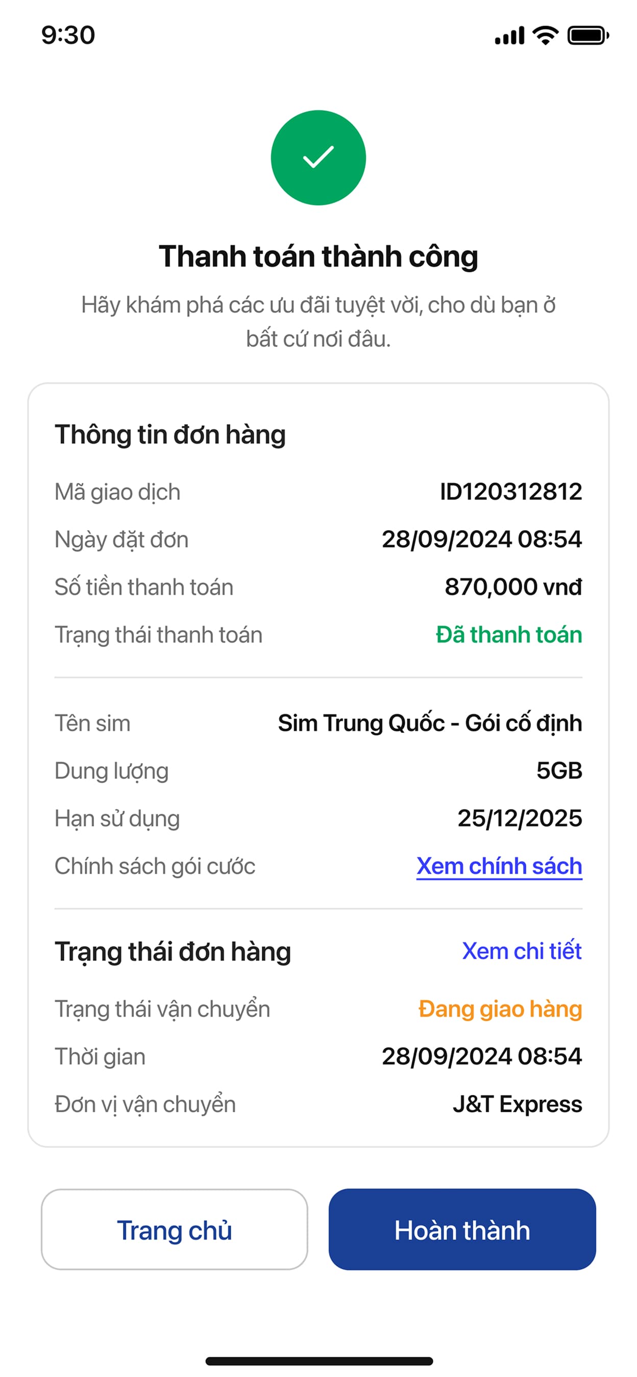
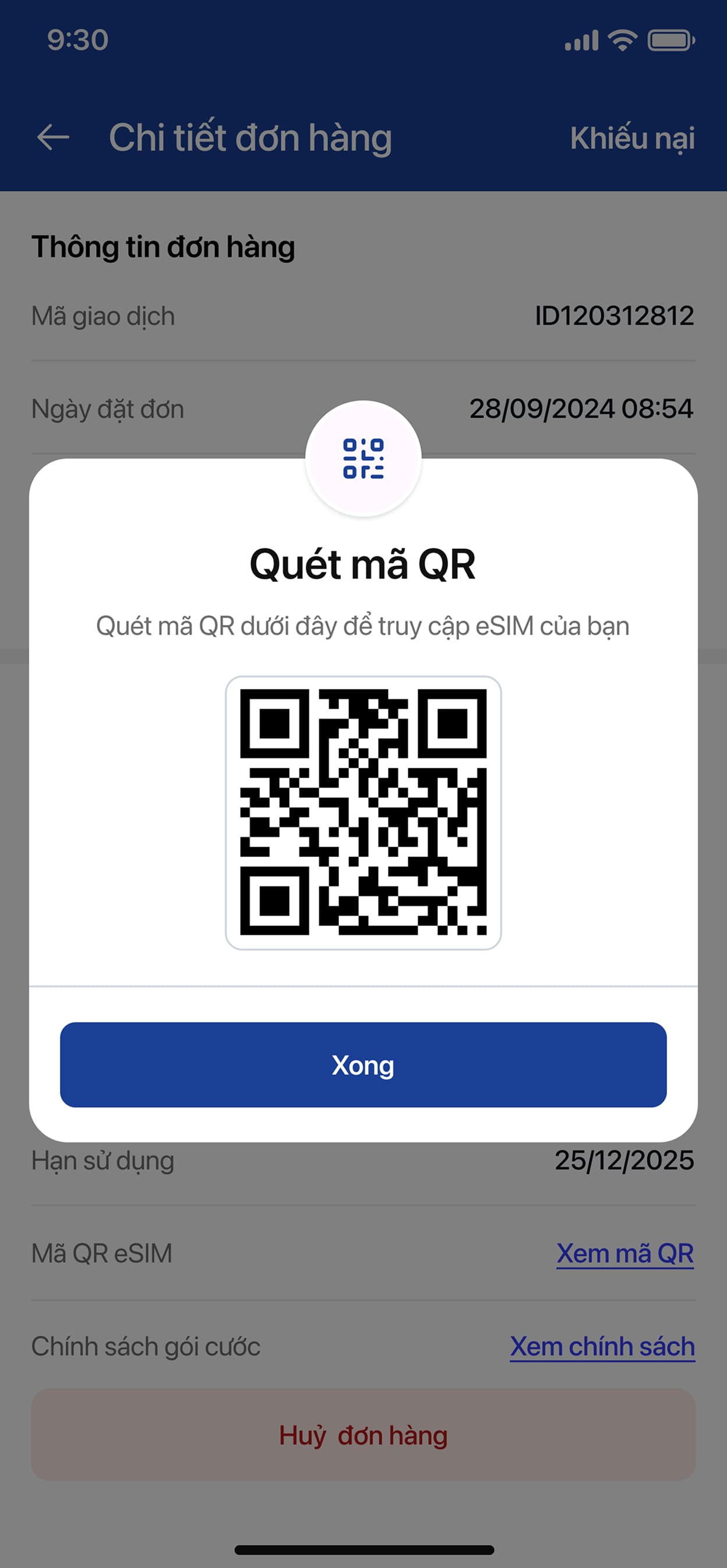
Orders & Support